Press Kit
Brand Guidelines
Logos, colours, fonts, and usage rules for press and content creators.
Logo
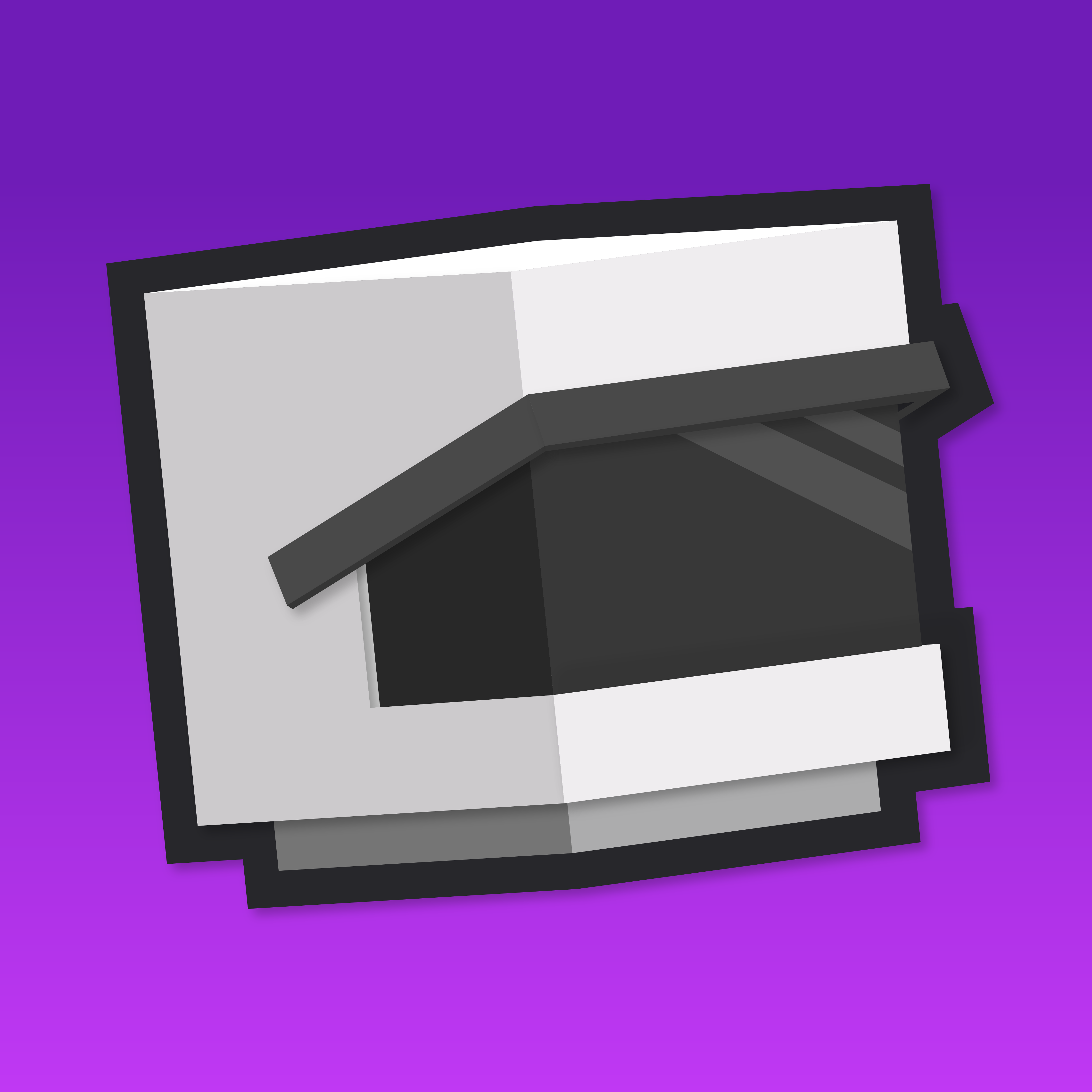
A stylised astronaut helmet. Use it as the primary mark wherever a square icon is needed.
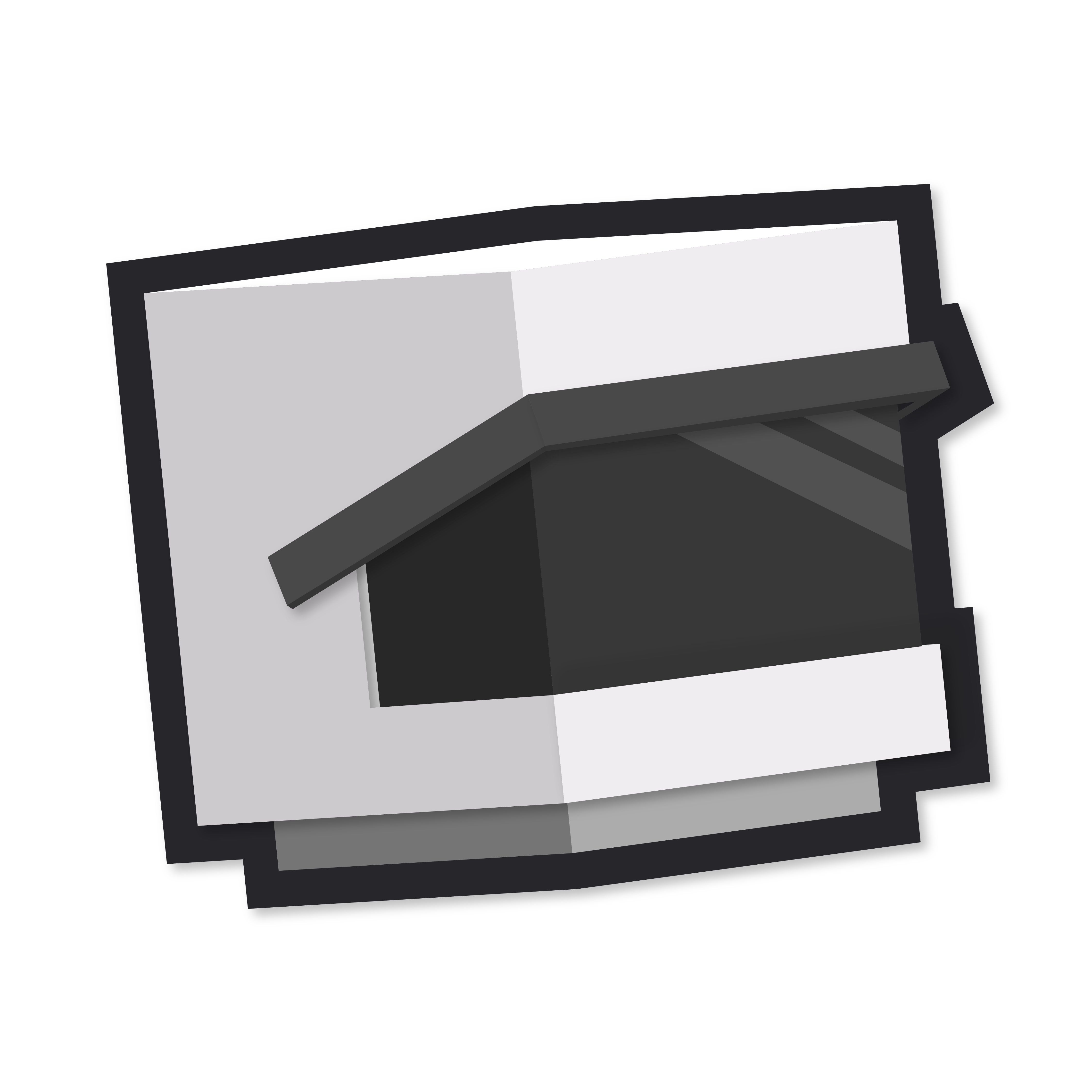 Icon on dark
Icon on light
SOLARIS
SOLARIS
Icon on dark
Icon on light
SOLARIS
SOLARIS
Wordmark
When space allows, use the full wordmark alongside the icon. Always uppercase.
SOLARIS
Paytone One · All caps · Brand gradient on dark, dark on light
Colour Palette
Core brand colours. Use these exact values.
Primary Blue
#325AD3
Primary brand colour
Secondary Purple
#6929B7
Gradient end
Brand Gradient
#325AD3 to #6929B7
Primary gradient (135deg)
Season Blue
#389CFF
Season / highlight accent
Accent Warm
#F59E0B
Warnings, highlights
Accent Green
#10B981
Success states
Background Dark
#121218
Primary background
Card Background
#1E1E2C
Cards, elevated surfaces
Typography
Two typefaces, both free on Google Fonts.
Display / Headings
Paytone One
SOLARIS: A New Dawn
Body / UI
Nunito
The quick brown fox jumps over the lazy dog. Body copy, labels, and UI text all use Nunito at various weights.
Usage
Keep it consistent.
Do
- Use the official PNG downloaded from this page
- Give it breathing room and don't crowd it against other elements
- Write SOLARIS in all caps when referencing the brand name
- Use it on both dark and light backgrounds, the transparent PNG works for both
- Scale it proportionally
Don't
- Recolour it or swap the gradient for something else
- Stretch, squash, or skew it
- Add drop shadows, glows, or outlines to the logo itself
- Drop it on a busy background where it gets lost
- Recreate it from scratch or modify the shape
Need More?
A full branding package with logo variants, wallpapers, and additional assets is coming soon. Until then, reach out on Discord.